Tuesday, June 4

Her Story

 Standing on the bridge, she wears a blank expression on her face. Her hair as dark as the night that embraced her, flowing as smooth as silk down her figure. Her lips redder than blood, eyes staring coldly into the city night sky. Without a doubt, she's a beauty. The expensive fabric that clad her body suggests she is currently well-off. She exudes the vibe of the wealthy.
Her eyes, it's as if they are telling a story. It's as if she has so many questions, but none were answered. She's so tired of thinking for answers. Her expression speaks of the lost of hope and trust. As the city shines with much light, she wanders off alone, avoiding the heated atmosphere in the town, posed by the red highlights. It's as if she gave up on trying to fit in, of trying to live up to the society's expectations. She came to realize the impossibilities to escape from the stereotypical and hypocritical society. Her silent cries to be set free, but knowing it's impossible, she kept them hidden and sacred. She could only voice it out to herself. She could only hide who she really is. She could only wear that false facade and be the person that everyone expects her to be. Seemingly lost in her thoughts, she thinks if this was all there is to life. There has to be more.
But what?
The feeling of being surrounded by so many lives yet still feeling alone. The feeling of being offered so many directions yet still feeling lost. She seems to be looking at the reflection, probably from the building in front of her. As she maybe staring at her reflection, she asks, who is that? All the doubts and uncertainties. She continues to ponder by herself quietly in the noise of the city, standing on the bridge.

References

The color PINK

Like most girls, yes, my favorite colour is pink!
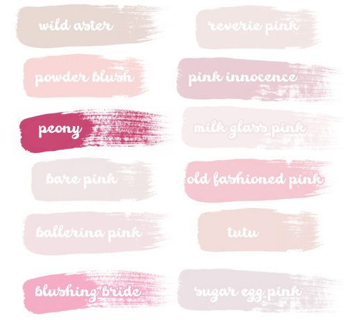
Pink is a colour between red and white. It exists in many different hues:
I love every shade of pink. It speaks a lot about how I feel.
According to most color personality psychology, pink represents acceptance and relaxation. Those two are what I seek in life: A place that I can rest in and be who I am.
Pink brings out the childlike femininity and girl-like essence in me. It allows me to have immature entices and continue dreaming. You can call it a princess syndrome but it's not surprising because I happen to be the baby of my family. My only sibling is my elder sister who's older than me by seven years. The fantasies that comes along with the color pink opens a path for me to continue chasing my dreams, like how a child chases a butterfly. It helps me overcome the harsh reality and believe in wonders, miracles and happily-ever-afters. That, and it also allows to me to break free from the teenage responsibilities that I now have to carry.
It's also cheerful and lively. It is fun and screams enjoyment. Again, another shout out to freedom. It helps me have faith that there is more to life that just this, that there is more good than bad in this world.
Putting fun aside, people say that pink roses represent appreciation and affection. I'm one of those people who cry whenever I watch an emotional movie or read a romantic love story. I tend to imagine myself in other people's shoes and sometimes I'll over think it. My level of empathy is unnerving, even to myself. I even cried watching The Simpsons Movie. Does anyone remember the time when Marge left Homer?
It also carries forth grace and elegance. The way the blush pink wedding dresses blend with any skin tone and colour. The harmony that creates a color blindness in races. Pink brings out the beauty in any female.
Besides being sweet, I also find the color pink unbelievably sexy. The way the color lures our attraction and keeps our eyes fixated on them.
It's daring, wild and crazy but there's always an undeniable hint of femininity. Obviously, I'm not exactly the shyest or sweetest person out there, but the pink in me tones down my barbaric personality.
Or at least I hope it does.

So these are the reasons why I love the color pink!

References
Source: http://zenx007.deviantart.com/art/Tears-Of-Joy-by-M3g4sh0ts-287016744
Source: http://farm3.static.flickr.com/2459/3741089241_ceed9fe2aa_o.jpg
Source: http://25.media.tumblr.com/tumblr_m26fccsVvq1r1rtefo1_500.png
Source: http://favim.com/orig/201105/26/antique-pink-room-shabby-vintage-Favim.com-56078.jpg
Source: http://decorlinen.com/images/bedding/bedding-3.jpg
Source: http://prosser.bethel-church.org/blog/files/2012/02/Joy-in-pink.jpg
Source: http://wallpapersus.com/wp-content/uploads/2012/11/Withered-Pink-Roses.jpg
Source: http://24.media.tumblr.com/tumblr_mdecp7wfkb1qb0t40o1_500.png
Source: http://www.7rt.org/wp-content/uploads/2012/12/Pink-roses-box-love-wallpapers-heart-wallpapers-valentine-wallpapers.jpg
Source: http://cdn-s3-2.wanelo.com/product/image/2562055/original.jpg
Source: http://www.wedshare.com/blog/wp-content/uploads/2009/08/blush-pink-wedding-gowns-lg.jpg
Source: http://www.nsmbl.com/wp-content/uploads/2013/01/pink-beach-hair.jpg
Source: http://s5.favim.com/orig/51/paint-pink-hair-movement-model-Favim.com-545378.jpg

Sunday, June 2

P&E of Design: Drawing

Based on what I learnt on principles and elements of design, I drew a handsign that spells out blood.
I used the all the principles of design: composition, proportion, balance, repetition, dominance, harmony, contrast, unity and variety.
I used six elements in design: line, shape, colour, tone, direction, and size.
Without colours
With colours

Thursday, May 30

Elements of Design

LinesLine is straight or curved, heavy or light, soft or hard or a mixture of them all.
Characterize a shape by being the edge of an area or surface, colour, tone or pattern – it becomes an outline or contour.
Show movement, suggest rhythm, creates texture, indicates emotion.


ShapeShape can be bordered by a Line.
Defined by colour, texture and tone.
Suggest movement or emotions, sharp and clear or hazy and suggesting something.

Colour WheelColour is an element of design with endless variety.
Three primary colours, red, yellow and blue.
Three secondary colours, orange, green and purple.
Tertiary colours are a mix of the primary colours, forming many different colours.
Temperature (cool or warmth), intensity (strength and purity).
Hue (quality), tone value (degree of lightness or darkness).
Tints (white opacity), and shades (dark opacity).
Analogous colours, hues lying near each other on the colour wheel.
Complimentary colours, hues opposite each other on the colour wheel.
Discord colours, opposite colours are together and one is a tint.

ToneTone is lightness and darkness.
Light reveals, shows the world to us, and shadow gives meaning to the things we see.
Provides solidity, volume and weight, gives the impression of distance, gives emotion to an image, creates rhythm, with the eyes jumping from one dark tone to another.
It is the property of Colour.
The way it catches the light, so that sharp changes are made by deep corners, and gentle ones by smooth gradual changes.

Texture

Texture is the part of the surface that can be felt or seen.
Concerned with touch, how something feels (rough, smooth, spiky, soft, velvety, regular or irregular).
Suggest emotions by linking with the memory of how things feel.

Direction
Direction is about how our eyes move around the artwork (horizontal, vertical, curved, sloped or straight).
Suggest movement by the speed at which it is changed, shows balance (stability or imbalanced), gives tension, has emotional impact.

SizeSize is about the bigness or smallness of an area.
Gives space, it can make closer objects appear larger and make distant objects appear smaller.
Given by comparing one element that is larger or smaller than the other, and make a particular element look important.
Mass


Mass is the amount of material in any sculptural work, painting or drawing.
Space or Void, refers to the lack of mass.


References
Source: http://www.canleyvale.hs.education.nsw.gov.au/Winning%20websites/art/eod.htm

Principles of Design

Composition
Composition is about visual organisation.
The way an artist composes or combines the elements of the work to give clarity and order to their ideas.
The way our eyes are guided around the artwork.
With Unity, the elements of the artwork go together to form a oneness, a wholeness, which satisfies the eye.
It is involved with and governed by the principles of design.

Proportion

Proportion is the relationship between sizes
The feeling of unity created when all parts (sizes, amounts, or relate well with each other.
The warping or normal proportions to suggest emotions or affect the status of a subject.


Balance
Balance is the distribution of elements in a work of art.
The control of the elements in attracting attention, which must be evenly or unevenly spread over the area; interesting throughout the art work, without being static or chaotic.
Symmetrical balance, the elements used on one side of the design are similar to those on the other side
Asymmetrical balance , the sides are different but still look balanced.
Radial balance, the elements are arranged around a central
point and may be similar.

Repitition
Repetition is the use of similar or connected pictorial elements, whether regular or irregular, more than once in the artwork.
Radiation, the repeated elements spread out from a central point.
Gradation, the repeated elements slowly become smaller or larger.
Rhythm is the rate the eye moves throughout the work of art.
This is usually because the eye moves, jumps or slides from one similar element to another in a way similar to music.


DominanceDominance is the focus given to a part of an artwork.
Helps to create Unity as the eye is focuses on a key point around the image by pictorial elements.
Created by contrasting pictorial elements such as line, shape, tone, texture, direction, size or colour.

HarmonyHamony is the pictorial elements of the same type that “go” together.
Made where the eye is used to seeing objects together, so they form a group.
Create feelings, similar elements (calm and pleasing) while contrasting elements (energy, vitality, tension or anger).

Contrast
Contrast is the pictorial elements that stand out because they are dissimilar.
Made by putting objects together that do not normally “go” together and therefore make each other stand out more, than they would separately.
Gives variety and makes the elements more lively.

Unity is the sense of oneness, of things belonging together and making up a coherent whole.
Done by repeating elements, overlapping shapes and directing the eye of the viewer around the work from one similar element to the next or along a line or shape.
The eye is directed by the principles of design and composition so that the artwork has Unity.
The main function or job of the principles is to organise the elements into a unified artwork.

Variety gives an artwork interest and vitality, as the elements are repeated with enough change or difference to enhance each other.
It is the contrast and harmony work together to give unity.
Too much leads to confusion and disunity. Too little leads to boredom.


References
Source: http://www.getty.edu/education/teachers/building_lessons/principles_design.pdf
Source: http://www.canleyvale.hs.education.nsw.gov.au/Winning%20websites/art/pod.htm

Abstract Painting

People say that the way you feel could be represented in the way you draw. I was listening to Dash Berlin's album, #MusicIsLife when drawing this. The songs were strong and exciting, embodied by the colorful splatters. There were many different feelings and emotions involved in every song. The designs on each splatter are like the lyrics to the songs, each having their personal meaning. As an album, however, I felt that it was a whole; it felt like a journey through someone's life, one that was similar to mine. Like how the album has brought so many people together, it also brought the patches of my heart together. The darkness of the background and faded rainbow represents the hurt in our lives. We're all broken at some point of our lives, but that doesn't mean we should lock the doors to our hearts.
Thus, the keyhole in the middle of the heart is to say, "Unlock yourself. Be free.

References
Source: http://www.youtube.com/user/DashBerlinChannel